FIP vs. SIERA: A Comparison of Stats
- Nerds Baseball

- Jul 18, 2022
- 7 min read
Hitting stats are pretty straightforward. That's not to say they're completely simple and easy to understand the significance of, but with hitting stats, one has the luxury of a stat like wRC+. It is an all encompassing hitting statistic that is park and league adjusted, a baseline stat you can rely on to measure total hitting production. Pitching, however, is a little more complicated. There doesn't seem to be a pitching equivalent to wRC+, and there are multiple stats to choose from, the most popular being FIP and SIERA. Both of these stats try to somehow measure pitching without being hindered by the variability of batted balls. Essentially, the widespread theory pioneered by sabermetrician Voros McCracken states that pitchers have little to no control over how many hits they give up per batted ball (their BABIP). A pitcher's BABIP will almost always regress to the mean (around .300) as time goes on and the sample size becomes larger. So a lot of measuring how good a pitcher performs has to do with eliminating the confounding variable of BABIP.
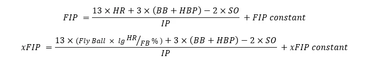
FIP eliminates this variable in a literal sense, as the only things that go into the FIP calculation are strikeouts, walks, hit batters, and home runs. There is also a constant in the FIP equation, but all that does is put FIP on the same scale as ERA so it is easier to read. It still has nothing to do with batted balls. There is also a stat called xFIP, or expected FIP. It is the same exact calculation as FIP, except the home run portion of the equation changes. The idea here is that the home runs per fly ball that a pitcher gives up, similar to BABIP, is not a measure of pitcher skill, but luck, and will regress with added sample size. Here's a visual to help understand these concepts:
SIERA is less straightforward, but I will attempt to explain it nonetheless. It tries to take FIP and add in some of the complexity of pitching (batted balls), without introducing a confounding variable to the equation. Essentially, it states some ideas such as:
- High strikeout pitchers generate weak contact more often, resulting in a lower BABIP
- A low-walk pitcher walking someone is less harmful than a high-walk pitcher walking someone
- High strikeout pitchers can also limit how far the ball goes when a fly ball is hit (in other words, less home runs)
- Relief pitchers have lower BABIPS, and more variability
- Pitchers can have a skill of generating a certain type of contact (ex: runner on first and one out, a pitcher can try to induce a ground ball)
- The more fly balls you give up, the lower HR/FB% you have
- Ground balls go for hits more often than fly balls, but the more ground balls you give up, the less often they go for hits (essentially, raising your ground ball rate from 45% to 50% doesn't help SIERA as much as raising it from 55% to 60%)
Lastly, SIERA is also park and league adjusted, while FIP and xFIP aren't.
Now that that's out of the way, we can get into the nitty-gritty. Because as complex as these stats can get, they mean absolutely nothing until they can prove some sort of correlation. So I first decided to do what I always do when digging into a new and unknown statistic: testing their correlation to runs. Or in this case, since we're looking at pitching statistics, I separately tested the correlation of FIP, xFIP, and SIERA to earned runs allowed. To do this, I used team data from 2011-2021, as I only wanted to be looking at the past 10 years' run scoring environment. Additionally, the 2020 season was excluded from the data due to its abnormally small sample size. The results can be seen in the following scatterplot matrix:

For each scatterplot, every dot represents one team from one season throughout 2011-2021 (excluding 2020). The column labels on the top show you the variable on the x-axis, and the row labels on the right side show the variable on the y-axis. For instance, on the left-most column in the 2nd row, there is a correlation plot with earned runs on the x-axis, and SIERA on the y-axis. Diagonally there are some density plots for each respective variable, displaying a bell curve of sorts for the seasons provided. And lastly, the numbers labeled as "Corr" are the correlation coefficients of each combination of variables; the correlation coefficient of SIERA to earned runs would be 0.801. Correlation coefficients range from -1 to 1, -1 represents the strongest possible negative correlation, while 1 represents the strongest possible positive correlation. As the numbers get closer to 0 and further from either -1 or 1, the correlation gets weaker. For instance, 0.50 would be a mediocre positive correlation, 0.10 would be a very weak positive correlation, and 0 would mean no correlation in either direction at all.
The important parts of this scatterplot matrix to look at are the top row of correlation coefficients, and the left-most column of scatterplots, as these represent each variable's correlation to earned runs. All three ERA estimators seem to have a strong positive correlation to earned runs--that is to say when the x-variable increases the y-variable increases. FIP has the strongest correlation to earned runs at 0.893, while xFIP and SIERA are slightly lower but still generally strong at 0.815 and 0.801, respectively. The correlation coefficient is also known as the r-value in the world of statistics, and when squaring the value, we obtain the r-squared value. The r-squared value can range from 0 to 1, and the higher the value, the stronger the correlation, whether positive or negative. I find the r-squared value to be easier to conceptualize, as it is viewed as the proportion of the dependent variable (y-axis) that is predictable from the independent variable (x-axis). The r-squared value for FIP here is 0.797, which means that 79.7% of team earned runs from 2011-2021 can be predicted from FIP alone. Meanwhile, 66.4% of earned runs can be predicted from xFIP, and 64.1% can be predicted from SIERA. Again, FIP trumps the other two estimators here, but all three have at least a solid correlation to earned runs.
This tells me that in the last decade, FIP is a better descriptive statistic for pitchers than xFIP and SIERA. That is to say, it is better at describing overall pitcher performance than xFIP and SIERA. A pitcher's job is to limit the amount of runs they give up, so when we look at how a pitcher is currently performing, we want to determine which pitchers are best at limiting their earned runs. While this is all well and good, FIP, xFIP, and SIERA were never meant to be descriptive statistics. Their goal at statistics was never to sum up present performance. We can just look at ERA for that--the literal earned run average. ERA will always be the best descriptive statistic. The three big ERA estimators were always meant to attempt to predict future ERA. Not descriptive statistics, but rather, predictive statistics. Thus, I had to find a different approach to measuring the predictability of FIP, xFIP, and SIERA.
I now went and focused on player data rather than team data, and decided to take player data from the years 2010-2018. Why 2018? Well, I wanted to have as recent a range of data as possible. However, 2019 had juiced balls, 2020 was too small of a sample size, and half of 2021 had some of the best pitching metrics ever due to the widespread use of sticky substance. These confounding variables would hinder my ability to get the best possible data, so instead I eliminated the past 3 complete seasons, and added 2010 on the back end to get an extra year of sample size, and thus, reliability. I then took the ERA, FIP, xFIP, and SIERA for all qualified starting pitchers from 2010-2018 and organized the data into multiple data tables. Each data table included two years of data: the first data table was 2010-2011, the next was 2011-2012, then 2012-2013, and so on, all the way until 2017-2018. The idea was to use the prior year's FIP, xFIP, and SIERA, and test their correlation to the following year's ERA of that same pitcher--thus, assessing each ERA estimator's ability to predict ERA in the following year. Here were the year-by-year results, each value represents the r-value for that season and statistic:
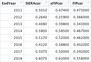
For instance, the first row has the "EndYear" listed as 2011, meaning it is from the 2010-2011 data. 0.5010 represents the r-value for 2010 SIERA to 2011 ERA for each qualified starter, and the same goes for xFIP and FIP. As you can see, the correlation coefficients have quite a bit of variation for each season, which is why it was necessary to complete this process for eight different sets of year-by-year data. I then averaged out the correlation coefficients and squared the average, in order to get the r-squared value from 2011-2018 for each ERA estimator. These r-squared values are listed below.
SIERA: 0.225
xFIP: 0.220
FIP: 0.187
Unsurprisingly, the more recently created and more complicated metric, SIERA, ends up winning, though xFIP is barely behind. FIP is a little further behind than the other two. Even at the top, however, only 22.5% of following season ERA can be predicted via past year's SIERA. This goes to show that although the baseball world has advanced greatly and exponentially in the past decade or so, the statistical revolution is far from complete. There is still a lot more complex data to be synthesized, a lot more potential statistics to be created (with better correlational values), and maybe another decade down the road, we will have a much better predictive statistic for ERA. Even at the peak of scientific discovery in the game of baseball, progress is still relatively slow. This should serve as an inspiration for all aspiring sabermetricians (including myself) that there is plenty out there that remains to be explored. Pitching is a complex thing to measure, and to date only 22.5% of it at best can be accurately predicted from one statistic/formula.
So while SIERA might top FIP and xFIP in this discussion, and it is certainly impressive that we can predict ERA even to this degree, there is more statistical analysis to be done. There is a big big future in sabermetrics that remains unsolved. For now.


Comments